
Referrals are valuable, but they should not be the only source of momentum. A scalable growth engine gives your team a clear way to attract, qualify, and convert the right opportunities every month.
A great logo looks effortless, which is why it’s easy to underestimate how much thought goes into creating one. Behind every clean, memorable mark is a careful balance of strategy, psychology, and practicality.
If you’ve ever tried sketching ideas for your own logo, you’ve probably realized how tricky it can be to make something feel just right. Here’s a look at some of the details professionals consider — the subtle things that make a logo work everywhere, not just on paper.
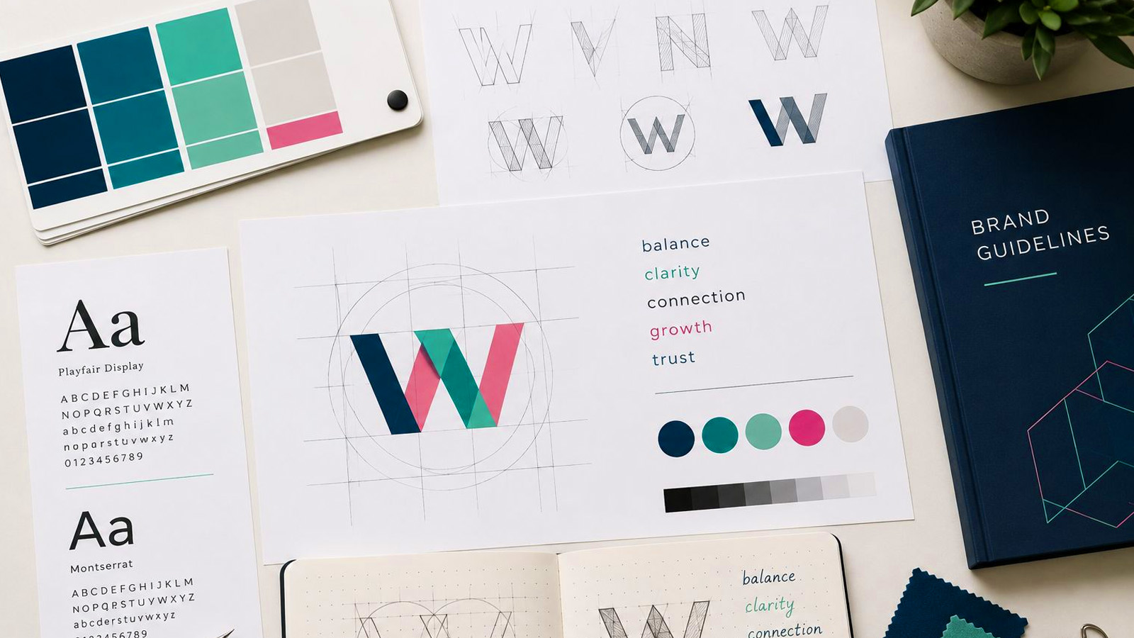
A logo doesn’t only represent what a business does; it reflects how it wants to be seen. Professional design begins with understanding the brand’s direction, audience, and tone.
Before thinking about fonts or colours, it helps to define how you want your brand to feel. Confident? Playful? Innovative? Those words quietly guide every decision that follows.
| Pro Tip! Before you start designing, write down three adjectives that describe your brand. They’ll help keep your visuals consistent with your vision. |
When people design their first logo, they often try to include too much—multiple icons, long names, detailed illustrations. In reality, simplicity is what makes a logo versatile and memorable.
A good logo should still look clear on a pen, a phone screen, or a social media profile. It should also work in one colour, not just full colour. The strongest designs are often the ones that use the least.
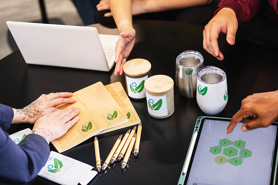
A logo isn’t one fixed image. It needs to adapt to different formats and contexts: a website header, a storefront sign, or a tiny app icon.
That’s why professional designers often create multiple versions, such as stacked or horizontal layouts, and test them across backgrounds. The goal is consistency, not uniformity — it should feel recognizably “you” no matter where it appears.
| Quick check: Do you have a version that works well in small spaces? Does it stay legible on both light and dark backgrounds? |
Fonts are emotional tools. They can feel elegant, modern, technical, or friendly before anyone even reads the name itself. Choosing or customizing typefaces is about alignment — making sure the style of the letters matches the personality of the brand.
Spacing, proportions, and balance are small details that have a big impact. A well-crafted wordmark can elevate even the simplest symbol.
Colour plays a bigger role than most people expect. It shapes first impressions, builds recognition, and influences mood. Blue often suggests trust, green evokes growth, and red conveys energy or passion.
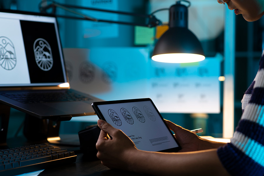
Good logo design also accounts for technical realities: how colours print, how they appear on screens, and how accessible they are to all viewers. Most logos have a few colour variations to ensure they look consistent wherever they’re used.
| Another pro tip! Test your logo in black and white. If it still feels strong, your design is solid. |
Design trends come and go: flat design, gradients, geometric styles. But a strong logo should last for years. Following trends can be tempting, but timeless design is built on clarity and balance, not novelty.
Behind every finished logo are dozens of small adjustments — testing how it looks at different sizes, balancing negative space, and tweaking proportions until everything feels right.
It’s a quiet process, but it’s what gives a logo that sense of effortlessness. A well-designed mark isn’t just attractive; it’s functional, flexible, and enduring.
When reviewing your logo ideas, ask yourself:
A great logo balances creativity with restraint. It captures something meaningful in a way that feels simple, adaptable, and timeless.
Whether you’re designing something new or refreshing an existing brand, understanding what goes into a strong logo helps you make confident choices and appreciate the quiet thinking behind a powerful visual identity.
Let’s make sure your next brand mark stands for something lasting.